Bailey
A Fixture
While I'm waiting for my next Napoleonic figure to arrive I decided to start on this little guy from Figone. It's Arthur as a boy in 1/35 scale (though a bit smaller than 54mm as he's a child). The 5th Dimension, a painting blog, did a contest earlier this year and this guy was one of the prizes I received.
I made a few minor modifications. I had some photo etch accessories from Etch Master, so I added a shield and shoulder strap so I could paint a few more details. I also switched out the sword blade. The one that came with him isn't that big and I really wanted it to look like a child holding an adult's sword. The scene I'm trying to create is Arthur right after he's pulled the sword from the stone.
The face was a bit of a challenge. I needed to downplay the details as too many shadows or dark lines would ruin the youthful look. Still, I tried to build up some contrast around the cheeks and under the chin. I tried to keep the clothing simple so I stuck with primary colors: red, blue, and yellow. For a little more detail I did a checkerboard pattern on his pants. I've done this on a number of figures so it's something I feel pretty comfortable doing. I started with a base coat of yellow and then took a medium blue and sketched in the squares. Try to keep the squares uniform and follow the lines of the pants. At this stage it's still pretty rough. Take a step back to evaluate the lines and square sizes. I then make a variety of tweaks to get it to look a bit better (adjust the squares to line are parallel, fix the sizes as needed, etc). Now I go back in with the yellow and do all of my shading and highlighting, followed by the blue. It's at this stage that I try to clean up the lines and sharpen the corners. Finally I do a number of passes back and forth between yellow and blue cleaning up whatever needs to be fixed. If you're trying this for the first time, pick a surface that is relatively flat (not too many folds and bends). And you might find larger squares are easier to begin with than smaller ones. On a relatively simple figure like this one those extra details can really help. I also plan to add some heraldry to the shield, but haven't gotten that far yet.


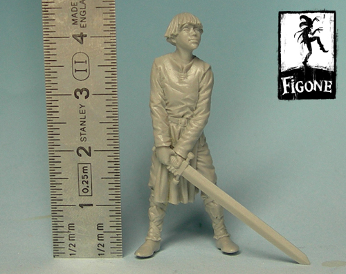
And here's the original figure before my minor additions.

I made a few minor modifications. I had some photo etch accessories from Etch Master, so I added a shield and shoulder strap so I could paint a few more details. I also switched out the sword blade. The one that came with him isn't that big and I really wanted it to look like a child holding an adult's sword. The scene I'm trying to create is Arthur right after he's pulled the sword from the stone.
The face was a bit of a challenge. I needed to downplay the details as too many shadows or dark lines would ruin the youthful look. Still, I tried to build up some contrast around the cheeks and under the chin. I tried to keep the clothing simple so I stuck with primary colors: red, blue, and yellow. For a little more detail I did a checkerboard pattern on his pants. I've done this on a number of figures so it's something I feel pretty comfortable doing. I started with a base coat of yellow and then took a medium blue and sketched in the squares. Try to keep the squares uniform and follow the lines of the pants. At this stage it's still pretty rough. Take a step back to evaluate the lines and square sizes. I then make a variety of tweaks to get it to look a bit better (adjust the squares to line are parallel, fix the sizes as needed, etc). Now I go back in with the yellow and do all of my shading and highlighting, followed by the blue. It's at this stage that I try to clean up the lines and sharpen the corners. Finally I do a number of passes back and forth between yellow and blue cleaning up whatever needs to be fixed. If you're trying this for the first time, pick a surface that is relatively flat (not too many folds and bends). And you might find larger squares are easier to begin with than smaller ones. On a relatively simple figure like this one those extra details can really help. I also plan to add some heraldry to the shield, but haven't gotten that far yet.


And here's the original figure before my minor additions.


