bonehead
A Fixture
Apologies to Einion!
It seemed like I flamed his poll question about realistic painting. That was not my intent. I think a more appropriate question is: what do you think makes a paint job realistic?
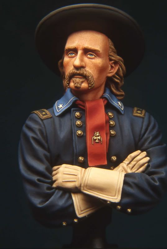
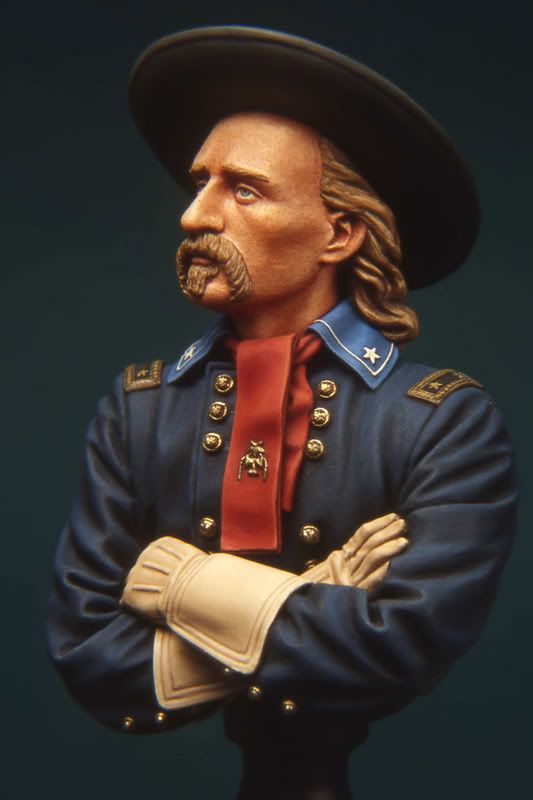
Einion already made some suggestions. He stated that it is important to depict different textures, such as the dull texture of cloth, the satin of leather, the dull metallic sheen of hair, the polish of wood on a rifle, etc. I agree with this whole heartedly.
Another issue, which I do not often see addressed is the necessity of maintaining the relative color balance when rendering shading and highlighting on figures. For example: one color I see "abused" quite often is "Dark Blue". This is a common uniform color. The proper shade generally is very dark indeed. But I often see it rendered with bright highlights that make it appear to be more of a "middle" blue. Not good.
Equally, white is another color that frequently suffers from heavy handedness. It is a color which responds well to only the most restrained tonal variations. Heavy shading of white tends to turn it gray and muddy. For me, I prefer to err on the side of restraint rather than the over shading and highlighting that has become popular in recent years. If I stand six feet away from a figure and I cannot tell, precisely, which color the painter intended for each item on a figure, then I feel it is over painted. But, that is just me.....
Just some thoughts to get the ball rolling....
What do you think?
Mike


