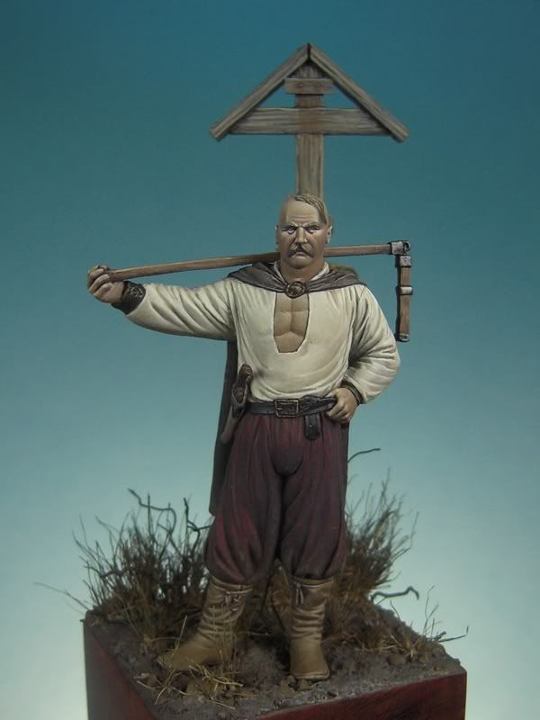
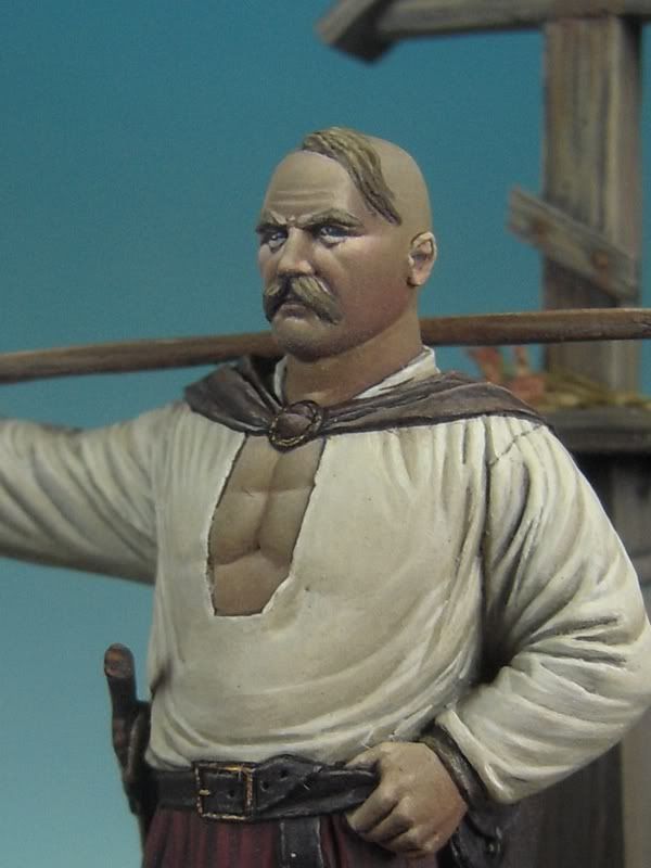
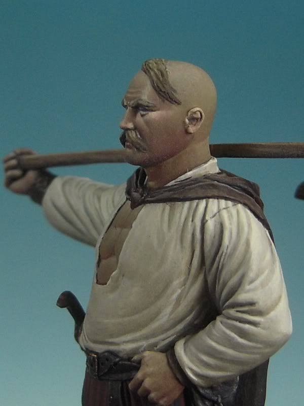
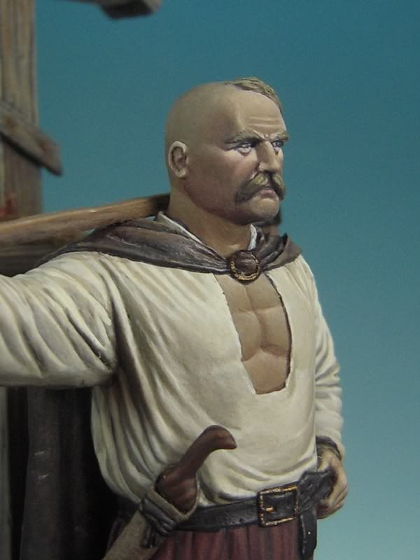
FERNANDO RUIZ cossack online course thread

planetFigure

Help Support planetFigure:

This site may earn a commission from merchant affiliate links, including eBay, Amazon, and others.
hi, I'm an italian modeller and sorry but I'm arrived just now on this thread!!!!!!
GREAT WORK from a great Master, I hope to learn a lot to paint last Art Girona Attila ( by latorre, is it right?) like you did. just a question: what do you use to "make matt" your figures? I mean is acrilic or enamel? I read you use air brush, right?
thanks for your help
franco
 
It is a good question by Patrick. I suppose that the ink's paints are used for washes and filters....but I don´t sure if Fernando use the inks for another effects....
 
Hello FeR,

What is this Leviathan Purple ink and why do you paint almost the whole figure with vallejo except this part?
Is it the same as a very thinned acrylic paint or is it really ink?
Is there a way to get the same result with a vallejo acrylic?

A lot of questions, sorry, but for me the course is also learning why the top figurepainters make these kind of choices. Like when to use ink instead of normal paint.

Grtz
Patrick

Sorry for the delay!!! Too much work.
Leviathan purple is a Citadel ink. It is like any other acrylic ink and you can use it to apply washes and other nice effects. You can get a very similar result with vallejo's purple really thinned.
The reason I use it instead of thinned purple, is because it's comes very handy to have a ready to use ink for a quick effect here and there. Also, the tone it gives is a bit more intense than normal paint thinned.
Keep in mind that you can always switch beetwen different brands of acrylics and even mix them. There are no compulsory colors, every painter has a favorite palette for doing things :)
Regards
FeR
 
hi, I'm an italian modeller and sorry but I'm arrived just now on this thread!!!!!!
GREAT WORK from a great Master, I hope to learn a lot to paint last Art Girona Attila ( by latorre, is it right?) like you did. just a question: what do you use to "make matt" your figures? I mean is acrilic or enamel? I read you use air brush, right?
thanks for your help
franco

Hi, Franco
Thanks for your words, glad you like my miniatures. Here, I explain the kind of varnish and how I apply it:
http://www.planetfigure.com/forums/showthread.php?t=37428&page=11
If you need any info about my paintjob in the Art Girona Attila, just ask.
Regards
FeR
 
Guau....great job. It is a beautiful bust. Congratulations. I take note about your process, I like it....
Thanks Fernando for your explanation.

Miguel.
 
Hi, all!
Here we have the next step of the painting course. Let’s finish the last details so we can have the miniature itself finished, apart from the terrain.
The elements still pending are the knife, the leather belt and bag, the wristbands, the flail an a couple of metal buckles.

Let’s start with the knife. First of all, I give it a black primer coat (I use black Citadel spray), as I use to do with small accessories that have diverse components:

133.jpg


I start with the more extense part, the sheat. I have chosen the following palette, trying as always to use some colors I have already used if possible:

138.jpg


From left to right: Basic skintone, Khaki, English Uniform, Burnt Cadmiun Red, Prussian blue and black. As it is a small area, I haven’t done a complete palette with highlights and shadows. The method has been a bit more anarchic ;)

After a base coat with English Uniform, I start applying texture with Khaki in order to achieve a suedish effect. That is done applying the point in small thinned dots with the brush:

134.jpg


Now, I apply basic Skintone, in the same way:

135.jpg


After that, a really thinned mixture of Burnt Cadmium Red + Prussian blue that I apply in a general way, insisting on the lower shadow areas:

137.jpg


Doing it that way, I’m shadowing without fully obscure the previous texture, achieving a natural look.

The grip will have a dark wooden tone with some grain. A very simple mix:

143.jpg


From left to right, Black, Scorched Brown and Orange Brown

Basecoat with Black + Scorched Brown:

139.jpg


1st highlight done with pure Scorched Brown. We start marking the grain:

140.jpg


An additional highlight with Scorched Brown + Orange Brown:

141.jpg


As I don’t want a much remarked texture, I won’t add any extreme highlight. There’s only left the piece of leather that holds the knife in the belt. As the tone will be the same as the belt, I’ll glue the piece straight in its place and paint it altogether:

142.jpg


The belt is not very complex. The overall tone will be dark so, I will just apply some highlights over a dark base color. The colors:

151.jpg


From left to right, Burnt Cadmiun red, Basic skintone, Black and Khaki.
Basecoat: Burnt Cadmiun red + Basic skintone + Black
Highlights: Base + Burnt cadmium red + Basic Skintone
Last Highlight: pure Khaki

Basecoat + first highlight:

144.jpg


145.jpg


2nd highlight:

146.jpg


147.jpg


Last highlight with Khaki. It must be very thin. The change in the color add some wear to the belt:

148.jpg


149.jpg


The last thing is a thinned wash in the whole area with a bit of the base color, so the tones get a bit more unified. Here’s the result:

150.jpg
 
Let’s go with the wristbands. Keeping in mind the previous tones, I use the following:

155.jpg


From left to right, Khaki, English Uniform, Scorched Brown and Black. I’ll use the same method as in the belt, a dark base color and some highlights.
Basecolour: Scorched Brown + Black
1st highlight: basecolour + English Uniform
2nd highlight: 1st highlight + Khaki
Last highlight: Khaki

Base coat:

152.jpg


1st highlight:

153.jpg


2nd highlight and final touch with Khaki. I have used this highlight to mark some laces it has:

154.jpg


Let’s start the wood of the flail. I wanted the look of new treated wood, the one logical in a tool in good use:

164.jpg


From left to right, Ice yellow, Orange brown, English Uniform, Basic skintone, Scorched Brown and Black.
For the base color, I have tried a light and pale orange tone.
Basecoat: Orange Brown + English Uniform + Black.
Sombras: washes with Scorched Brown and Black.
Highlights: Base color + Ice Yellow.

The basecoat:

156.jpg


157.jpg


1st shadow with a thinned wash of scorched Brown, insisting in the lower shadows parts:

158.jpg


159.jpg


Highlights. I won’t mark too much the grain, we just want to achieve a sense of overall highlighting:

160.jpg


161.jpg


And last shadow’s wash with black that also helps to mark the ends of the area. I also paint black the metallic parts of the flail:

162.jpg


163.jpg


165.jpg


For the metallic areas, we want a rough iron look that it is really simple to do:

167.jpg


From left to right, boltgun metal, tin bitz and black. All from Citadel
For the base, we mix those 3 colours. For the highlights, we add some boltgun metal. For the shadows, black. The final result:

166.jpg


Finally, we paint the buckles of the belt and the cape with a bit of Tin Bitz and a highlight of glorious gold from Game Color. (No pic of that mix, sorry :p):

168.jpg


169.jpg


With all this done, we would have the miniature itself finished. Next thing would be the terrain and we will be finished!

See you soon
FeR
 
Dear Fer, very good sbs, very useful for all of us to grow up our paint!!
thank you and thank you again.
About Attila ( art girona) I think you've used the same approach obtaining the same high level score. something about the colours?
And at the very end, I think you GENERALLY use vallejo, is it right? could you tell us why?
franco
 
Thank you, glad you like it.
When painting the Attila, I kept in mind the idea of a dark character. I used mostly neutral tones and a couple of colorful details to bring some interest. If you want info on a particualra area, I'll try to remember.
I generally use Vallejo and also some Citadel. There´s no reason why, I just use colours I like or I think they'll work in a particualr task. The only difference between them is that Citadel's tend to give a satin finnish more often than Vallejo's. Nothing that cannot be mended with some varnish...
Regards
FeR
 
Stunning work FeR. Just a quick one, Tamiya X21 flattens Citadel paints to a dead matt.
Carl.

I've been using Flat base and, due to the way I apply the paint, even with that I get a satin finnish when I don't watch out closely! :p
I mean, it actually works, of course, but not for me...
Regards
FeR
 
Hi, guys!
I know the last step of the course (the terrain) is due but, as most of you still have the miniature in diverse stages, I will wait a bit to put it on the forum.
Regards
FeR
 
Hi, guys!
I've been a bit busy finishing two miniatures for the Trieste show last weekend, but now I'm ready to post the next (and last) step of the course. Hope to have it ready today or tomorrow :)
Thanks for the patience!
FeR
 
Hi, guys!

Here we are. After some delay due to diverse reasons, it is the moment of posting the last step of this painting course.
First of all, here you have some pics of the finished miniature, excepting the terrain, as it was at the end of the previous step:

170.jpg


171.jpg


172.jpg


173.jpg


174.jpg


Let’s paint the terrain. This is the palette we’ll use. From left to right, Basic Skintone, English Uniform, Brown Violet, Scorched Brown (Citadel) and Black:

175.jpg


We paint it all with Brown Violet:

176.jpg


Then, we paint all the little stones with English Uniform:

177.jpg


We apply some highlights to them adding a bit of Basic Skintone:

178.jpg


A wash with Scorched Brown, to blend the tones:

179.jpg


Another wash with black to define the shadows and get a more grayish finish:

180.jpg


And some really thinned washes in some places with Basic skintone to achieve some dusty effect:

181.jpg
 
Let’s start with the vegetation. I had the idea of a dry terrain with some undergrowth, so I limited it to some bushes done with dry seaweed and some spare roots.

The dried seaweed is a natural product that you can find in some beaches. If you don’t have it at hand, you can also buy it:

182.jpg


Its use is very simple. We take a “pinch” from the seaweed ball, keeping in mind that, the bigger the pinch, the bigger the bush:

183.jpg


We take the “pinched” section from the upper part an cut its base to get a flat surface that will be easier to glue to the terrain:

184.jpg


In the flat side, we apply a bit of white carpenter glue:

185.jpg


And we put it where we want the bush:

186.jpg


Before keep on working in the same area, you need the glue to be a bit dried in order to avoid any vegetation loose. You can quicken it with a hairdryer. You can get a bigger bush with more seaweed patches to give it more volume or cover any desired area. In this case, it will be the cross’ base. It’s useful to notice how green things grow in their natural state. When you have any kind of pole planted in a field, the grass always grows taller and thicker at its base, because it benefits from its shadows in some moment of the day. Also, the seeds are less exposed to birds:

187.jpg


We add the pole to see if all fits:

188.jpg


And we add some other bushes to balance the composition, getting them smaller as they come to the front:

189.jpg


190.jpg


Now, we put some plants’ dry roots to create fallen branches in some points:

191.jpg


192.jpg


Now we have all vegetation. Let’s paint it. These are the colors:

193.jpg


Brown violet and Goblin green for the bushes and a bit of Scorched Brown for the fallen branches. We apply some thinned Brown violet to the bushes. Using a tone present in the terrain helps to get a good degree of integration:

194.jpg


After that, We give some soft highlights with Goblin Green, avoiding this color getting too much predominance:

195.jpg


Let’s finish with some thinned Scorched Brown for the fallen branches:

196.jpg
 
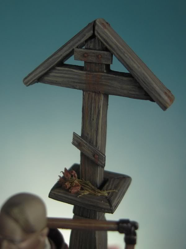
Now we have the terrain along with the vegetation. Now, we just have to paint the main terrain element, the road shrine. These are the tones we’ll use:

197.jpg


From left to right, Khaki, Basic skintone, Brown Violet, English Uniform, Scorched Brown and Black.
Basecoat: Brown Violet + English Uniform + Scorched Brown + Black.
Luces: Basecoat + Khaki + Basic skintone
Sombras: Basecoat + Black

The idea is some wood moistened by the rain and snow in the winter and dried by the sun in the summer. This wood uses to have a whitish look, with very marked grain.

First of all, I basecoated the whole shrine:

198.jpg


With an intermediate highlight tone, I marked roughly the grain, aiming the stroke to the highlighted area:

199.jpg


I finish a rough sketch in the whole piece:

200.jpg


Now comes the interesting part. I add the highlights in the upper areas and start using the diverse tones in the mix to give controlled washes that will add some tones to the wood, keeping the darkest ones in the shadows areas and the lighter ones in the highlight areas. That way, we achieve a double target; add richness to the wood effect and blend the strokes used to paint the grain to avoid any artificial look on them:

201.jpg


We finish the shrine area after area, to avoid forgetting anything. Also, we have to keep in mind that, the taller the area, more highlights has to receive:

202.jpg


203.jpg


204.jpg


206.jpg


The hardest part of the shrine is done. We paint the nails with a bit of black:

207.jpg


Let’s get them rusty. We give them a coat of Burnt Cadmiun Red:

208.jpg


With that same color, we do typical rust stains created by the rain:

209.jpg


To mark it a bit more, we add a highlight to the effect with a bit of Orange Brown:

211.jpg


We’ll add the last touch with some withered flowers in the shelf of the shrine, as if they were an offering left there in some past moment. I had those small flowers from a dry plant much more big. If you cut them the right way, they look like true flowers in scale:

212.jpg


We use a bit of thinned Burnt Cadmiun Red and Goblin green to simulate the dry petals and stems:

213.jpg


You have to be very careful when gluing the flowers with a dot of carpenter’s glue one by one:

214.jpg


215.jpg


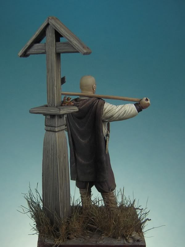
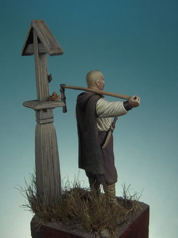
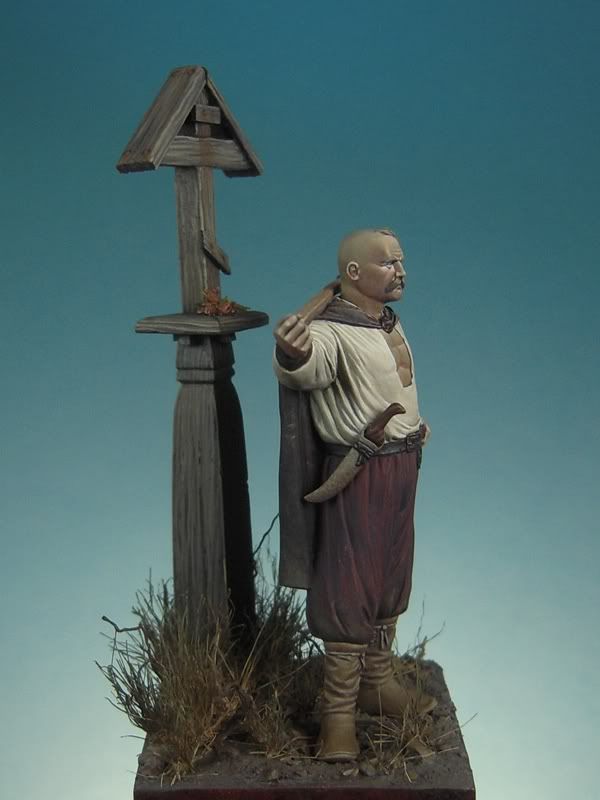
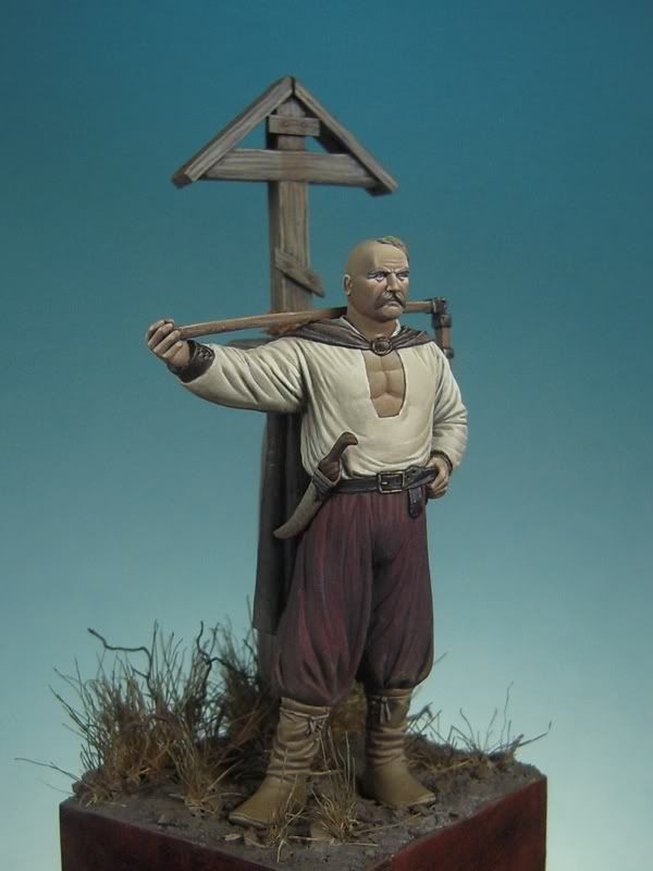
And here we have the finished terrain, with the shrine glued to it:

216.jpg


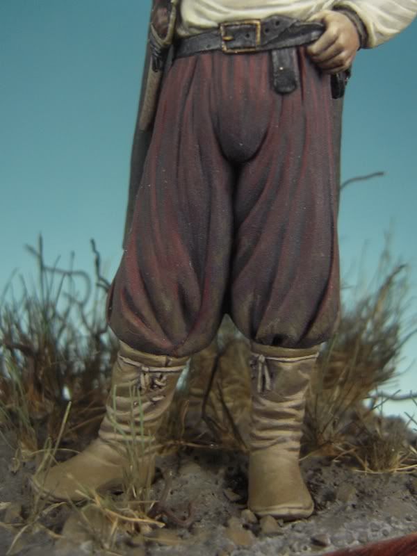
The next and last step consists in gluing the miniature to the finished base and giving some touches of dirt in his lower areas with the help of some colors present on the ground:

217.jpg


Khaki, English Uniform and Brown Violet. When doing dirt I prefer to build the effect very slowly to avoid getting all messed up. Here, we don’t need an specially dirty look:

218.jpg
 
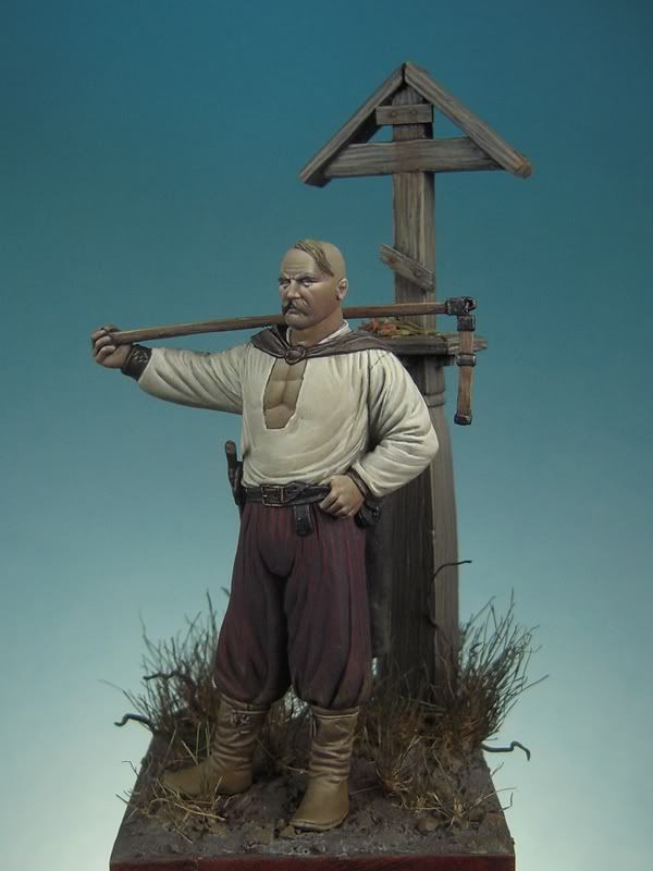
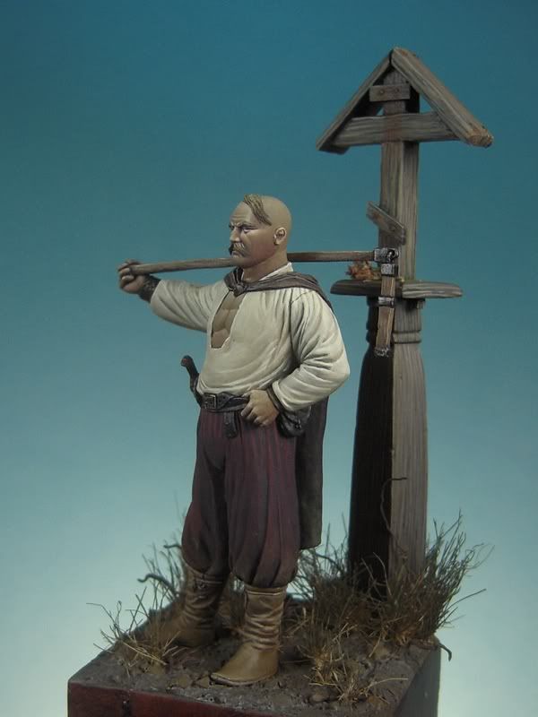
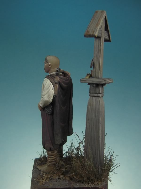
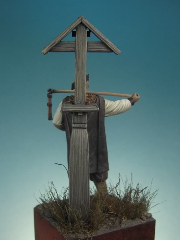
And now, the finished miniature!

219.jpg


220.jpg


221.jpg


222.jpg


223.jpg


224.jpg


225.jpg


226.jpg


227.jpg


228.jpg


229.jpg


230.jpg


231.jpg


232.jpg


As an epilogue to this online course, I would like to say that it has been a really interesting experience to share all this process with all of you. It has been really rewarding and I have learned some new things. Hope you have learned some useful tips to apply to your painting and you have enjoyed it!
Greetings
FeR

Ps. Of course, we leave the course open for all of you that haven’t finished the miniature yet. You know, any doubt, just ask…
 
Back
Top