What am I missing here?

planetFigure

Help Support planetFigure:

This site may earn a commission from merchant affiliate links, including eBay, Amazon, and others.

Steve Ski

PlanetFigure Supporter
Joined
Jun 9, 2011
Messages
3,856
Location
NE WA, USA
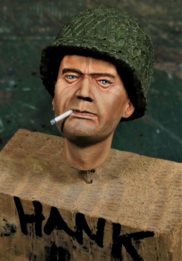
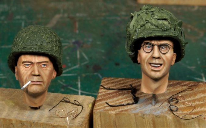
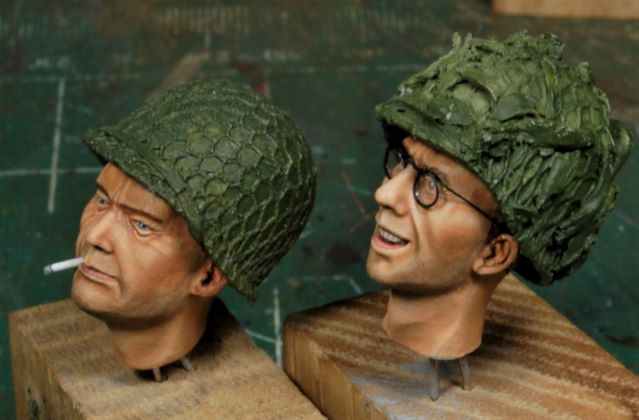
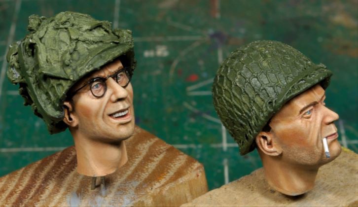
I've been attempting Mike-the-Kiwi's facial texture, but failed to produce acceptable results. I have moved on for now and will work that challenge on a few busts where I think the learning curve will work better for me.

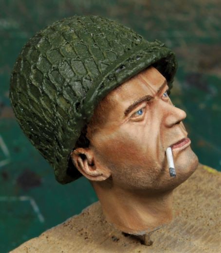
However, I’m thinking I’ve missed some depth on this face on the left, maybe more highlights. I don’t want to trash the basic light complexion, but I’m having to let it sit far a bit to figure this out, which is why I’m asking you all.


All comments welcome, please. Thanks, Ski.

P.S. Remember, I'm an oiler.


_DSC0885b-vi.jpg
_DSC0887b-vi.jpg
_DSC0890b-vi.jpg


Hey Ski,

Good looking faces so far, methinks. Not familiar with Mike's technique but to my eye (for what it's worth), I think you're on the right track in thinking to bump up the contrast just a tiny bit more.

Cheers and bash on,

Brian
 
It doesn't look like all that great a face sculpt to start with. He's supposed to be a young, super-fit guy in his twenties. He looks at least forty. In my untutored opinion, the wrinkles on the cheeks don't look right at all. Maybe try removing those?
 
Great looking faces Steve, but I’d advise to darken the shades on the forehead, temples and under the chin/neck. Those helmets add considerable contrast.
General complexion looks very realistic by the way!

Cheers,
Adrian
 
Missing? Not a thing, I think they are very good as they are.
I've never been big into the hard contrast style between highlights and shadows (I'm an oil painter as well). I think of those as "tarted up".I think so many people have become accustomed to the hard contrasts that many acrylic styles have, that the smoother oil transitions look too "weak" to their eye. I would be very happy indeed if my faces all came up to his standard.
 
Thank you, Gents.

I greatly appreciate the input. I knew yall would see what I'm missing here. I will tone down some of the wrinkles, and yes, he's an older face for sure. I will also add just a smidge of highlights to the upper cheek area and bit more darkness to the area under the helmet and under the chin as well.

I’m like you, Jason, I don’t want to go too far into the exaggerated contrast. That’s why I like oils so much, the blending makes for a much smoother transition between areas, IMHO.

The reason I was posting here for an assist is I seem to have misplaced my mental mojo that was present when I painted Corp Reynolds in my Arnhem vignette. I know it sounds a bit crazy, but I need to redress the basics. I’ll get it sorted out and work it again, but I need to see improvement, and right now I’m just towing the line with these current results. It’s kinda bothering me, if ya know what I mean. I'm not trying to be anal retentive here, I just know I can do better, if that makes sense.


Awesome, Thanks again you guys! Cheers, Ski.
 
Hi Ski
Good seeing latest project, kudos for asking feedback to hear how others see this pair. Comments from guys above will be invaluable. Key will be for you to Check & Adjust based upon what your sense is “not right”. Be kind to yourself though, as these are looking good.
Also don’t underestimate the natural contrasts you will get when rest of the figure surrounds the face. Helmet & torso assembled with the head always add a dimension that viewing the head on its own does not compensate for.

To my eye the right face has advantages over the left one. His happy expression, with the glasses you’ve added, help give him more character. His overall complexion is lighter too, reinforced by spectacles. Compared with rather gloomy chap on left, who just looks bored, with aged expression.
What do you want him to look like? A weary warrior? if so try make him more grubby or if not, consider some higher lights & a little red (adds warmth) on his features (nose tip, edge of mouth, eyelids) to help give more emphasis maybe.

By the way have you named them both?
That may help you connect with their backstory & in turn help you come to terms with their expressions & your interpretation of each.

Trust we’ve helped you with some ideas, plus reinforced your thinking on what’s next, to give you enough impetus to carry on. :)
MikeTheKiwi

P.S. Do like the little spectacles you’ve got laying around.
You seem to have had fun making these too!
Just seen notes on these in master WIP thread too Ski - good tips on how to approach this under-utilised accessory
 
Great looking faces Steve, but I’d advise to darken the shades on the forehead, temples and under the chin/neck. Those helmets add considerable contrast.
General complexion looks very realistic by the way!

Cheers,
Adrian
 
Great work... I too struggle with faces and have tried many techniques.. I feel better using oils but am having another bash with acrylics,, its trial and error.. And at the end of the day, as long as your happy..
 
Thank you, Gentlemen, and thanks for the assist.

Mike, lots to think about, good points all. I’ve never thought of naming these guys, or any for that matter, but that’s an interesting idea. So, the older face is now "Hank". Yep, "Hank" it is, and he’s a crusty from back east, lol, a farmer’s boy.o_O I’ve been adding the suggestions the guys mentioned earlier, so far so good. I’ll warm up his features a little more, some red tones would not hurt one bit. Yesterday went well and I’m liking what I’m seeing. I’ll post em when I got em.;)

Thanks again, Adrian. I have done some additional reworking on the shadows a you mentioned, so they should give it a little more contrast without blowing out the subtleties. I appreciate the input, Amigo!

Thanks, Warren. Best of luck with the acrylic run, you’re a braver man than I.


Thank you, Brock. Those specs, I just wasn’t gonna let me go and had to make em work.
 
Thanks, Steve, I appreciate that. ;)

I hear what you're saying about these faces, but sometimes we gotta go with what we got, lol. I personally do like the kid with the glasses, he's got character and is a close representation of the historical photo, but ya, Hank looks a bit old for an AB Trooper.

Remember, some of the old guys can kick some hinny over them young punks, right?:eek: I've heard it said, "Beware of Old Men in an occupation where most die young".
 
Refining Hank.

Working from the suggestions you all have put forth I went about making some changes. I did not push the contrast further than I felt comfortable doing. I know some like it a bit more pronounced, but I personally prefer the mid-range, depending on the figure, of course.

Taking these closer pics really brings out the boofs such as, cauliflower ears, dust specs, rough unfinished or not sanded areas, and rough blended areas of the oil work. Some of this will never be seen by the observer if this was an in-person showing, but we “play” to the camera and some of it just can’t be hidden. I will make an attempt to correct some of those issues, but for the most part I’m calling Hank done. The first pic is a bit blurry, sorry about that.

_DSC0891b1-vi.jpg
_DSC0894b-vi.jpg
_DSC0896e-vi.jpg


I added subtle red tones to warm up the eyes, cheeks a little (which need more), and around the nose and edge of the mouth, plus a smidge around the ears. I darkened the forehead, under the chin, back of the neck, and toned down the wrinkles on his face. Looking back, the wrinkles were a bit on the heavy side. Also, I highlighted the cheek areas a little more as well, they were too dark.

And finally, to give this chap a bit of a story, he’s definitely older than the rest of the young chaps, so he’s been promoted to Sgt right out of jump school. Hank now has a history to build upon. Thanks for that tip, Mike.

If you guys still see anything that could be worked, please holler and I’ll make the adjustments as best as I can. All of your input has been very valuable in identifying the weak areas. I can’t ask a non-painter to point them out, they’re clueless. “Brutally Honest – Critique Center” is an incredible tool on this site, kudos to PF, awesome!

Thanks again, Gents. Cheers, Ski.
 
I'm an oil guy who has spent the last year trying to get the hang of acrylics, and will say (having tried Mike's techniques from his book) that the quick dry time of acrylic allows for the visual texture Mike gets. I can't do it :), but I can see how it happens. Oils blend better because they spread to an incredibly thin translucent layer, while acrylics tend (for me) to have a crustier edge unless applied as barely tinted water. Does that make any sense? Regardless your stuff it always great.
 
I'm an oil guy who has spent the last year trying to get the hang of acrylics, and will say (having tried Mike's techniques from his book) that the quick dry time of acrylic allows for the visual texture Mike gets. I can't do it :), but I can see how it happens. Oils blend better because they spread to an incredibly thin translucent layer, while acrylics tend (for me) to have a crustier edge unless applied as barely tinted water. Does that make any sense? Regardless your stuff it always great.


Na, makes sense Bro. Either we got it or we don't, and frankly, Mike's got it, plain and simple. I'm not a groupie, so what ever works for someone might not work for others, but I sure wish I could get a handle on Mike's techniques, like you, period. I will Ruck Onward towards such results, regardless. I personally think this is exactly why this "Sport" is so much fun, we compete against ourselves! If we wanted to, we could join Spacebook, but there's more to this Sport than that spam! HA!

Great comments, Matt!
 
As usual, your technical excecution is outstanding Steve. I like these faces a lot, and more so, because you have not pushed the shadows and highlights to the excessive (and im my opinion unrealistic) level of the "popular" box art artisits. I echo Mike, the glasses look ecxellent, a super addition, which I will use in future projects. As an aside, I'm not sure a soldier would have got through Para selection wearing glasses, as I guess they would be a hazard when jumping (or rather, when landing... :cool:), but I think he'll fit very well into your composition.


Missing? Not a thing, I think they are very good as they are.
I've never been big into the hard contrast style between highlights and shadows (I'm an oil painter as well). I think of those as "tarted up".I think so many people have become accustomed to the hard contrasts that many acrylic styles have, that the smoother oil transitions look too "weak" to their eye. I would be very happy indeed if my faces all came up to his standard.
 
As usual, your technical excecution is outstanding Steve. I like these faces a lot, and more so, because you have not pushed the shadows and highlights to the excessive (and im my opinion unrealistic) level of the "popular" box art artisits. I echo Mike, the glasses look ecxellent, a super addition, which I will use in future projects. As an aside, I'm not sure a soldier would have got through Para selection wearing glasses, as I guess they would be a hazard when jumping (or rather, when landing... :cool:), but I think he'll fit very well into your composition.

Well at least one did Henk, Steve looking well those I'd say, maybe Hank needs just a touch more stubble around the lower cheek areas
Steve


ghows_image-NC-2af2d76d-f838-47f3-b127-98bffe756853.jpeg
origin.png
 
Well at least one did Henk, Steve looking well those I'd say, maybe Hank needs just a touch more stubble around the lower cheek areas
Steve


ghows_image-NC-2af2d76d-f838-47f3-b127-98bffe756853.jpeg
origin.png

Are we sure these are Paratroopers and not just regulars? They are not wearing chutes.

That's not to say no paratrooper ever wore glasses, Im sure some managed to sneeked through, if it was a medical issue. Just as a lot of them lied about their age, to join up..
 
Back
Top